Home Tour: Guest Room Reveal
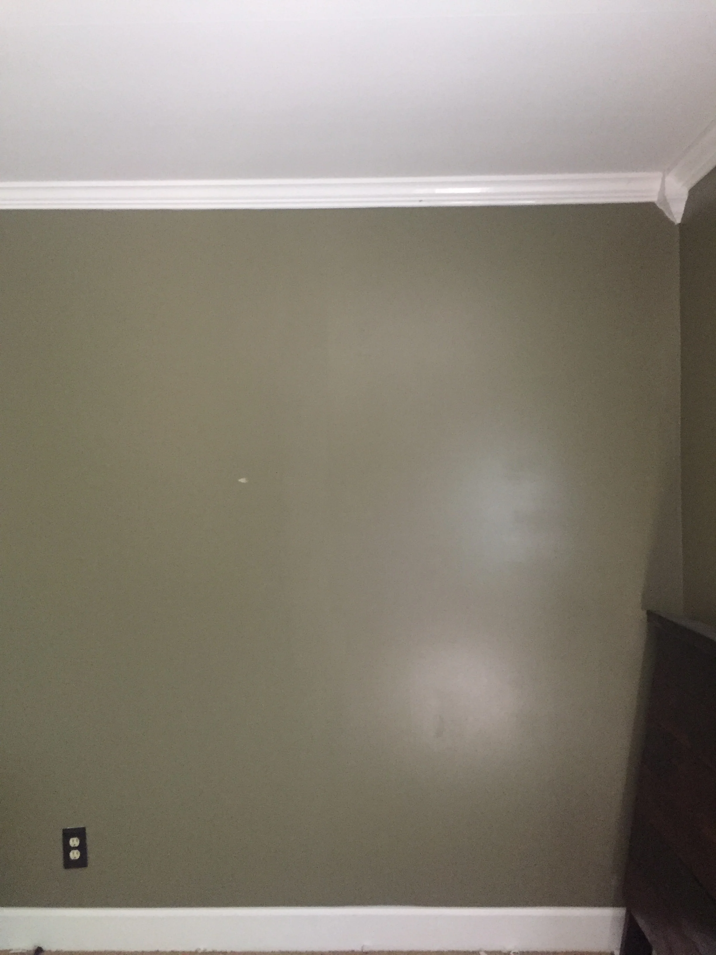
Hi guys! So over the last few weeks I've been working on a project that I'm so excited to share with you!! So my guest room/office has been a thorn in my side for so, so long now, but it always was further down on my list of projects so I never really dove in and tried to fix it. That is, until a few weeks ago when I found out that a few of my friends were going to come stay with me, and we'd need both the guest rooms and an air mattress ready to go so everyone would have somewhere to sleep. I didn't want to put anyone in the dark green, dingy room (which was its current state), and its the room with the access to my back porch, so I wanted to have it look a little nicer in case we grilled or decided to sit out on the deck.
So lets start with the planning process. In my initial vision for the room, I wanted navy/dark gray walls. I did all so much reading about how darker shades do well in dark rooms, even made a blog post about it, and I thought if I picked a cool hue, that the shadows would be cooler and then the room would feel less dingy. I even went to home depot with a friend and searched for about twenty minutes for the right shade of not to purple-y navy. Then, on spring break when I saw the navy walls in the condo at the beach (want to see a picture of the color I'm talking about? Click here.)
BUT - I eventually took a step back and started thinking about how a navy blue room would tie in with the rest of my house, in which all the other rooms are various shades of white, and decided that maybe I shouldn't go with such a drastically different palette in that room. So I sat down and made a list of things that I liked about that condo aside from the dark color palette, and – as with all great stories of home projects – I headed straight to Pinterest (you can see the inspiration board I made for it, here.)
I intentionally kept my favorite inspirational picture off of this board at first, because I wanted it to be a surprise! I fell in love with one i saw in an article from My Domaine of Carlson Young's truly incredible room (Photographed by Jenna Peffley) and then added a few other pieces that I liked or that I thought had a texture I could incorporate with what I had here at my little blue house
and this is what I came up with...
In the end I decided to keep white walls, but I still really, really wanted to bring in some navy blue. I also needed a way to balance the room since the window is in a weird place, its in the far left corner of the room when you walk in, and that room has always felt extremely unbalanced. After doing some research on budget friendly ways to brighten a room, I'd learned a bit about fake windows, or using mirrors to bounce light back into a room. After I found a really simple window-pane inspired mirror at Hobby Lobby, I decided I would hang it on the right side of the wall to balance out the mirror on the left, and I would hang a curtain rod above it to give it a little more flair. I also decided that some solid, navy blue curtains would be the perfect way to get that bold, dark accent I'd wanted in that room, without having to spend time painting(or future time repainting) a color that wouldn't flow with the rest of the house.
So while I was visiting my parents a few weeks ago, Mama and I went a bunch of different places looking for navy curtains – side note: WHY ARE CURTAINS SO EXPENSIVE?! We ended up at Home Goods looking at some end tables, and while I was wandering around the rest of the store, I found some nursery room curtains that were navy blue. It was a set that came with two panels, and for both panels it was going to be HALF the price of most of the one panel navy curtains we'd seen at other stores. I made a quick mental note to always check kids room decor next time I'm looking for anything.
I didn't want to spend money on new bedding or sheets, so I was really happy that the ones I have are orange and gray and would match with the blue curtains really nicely! I also already had throw pillows that were dark blue, and some pillows in other rooms that I decided to bring in, and I had the headboard that I built a few years ago.
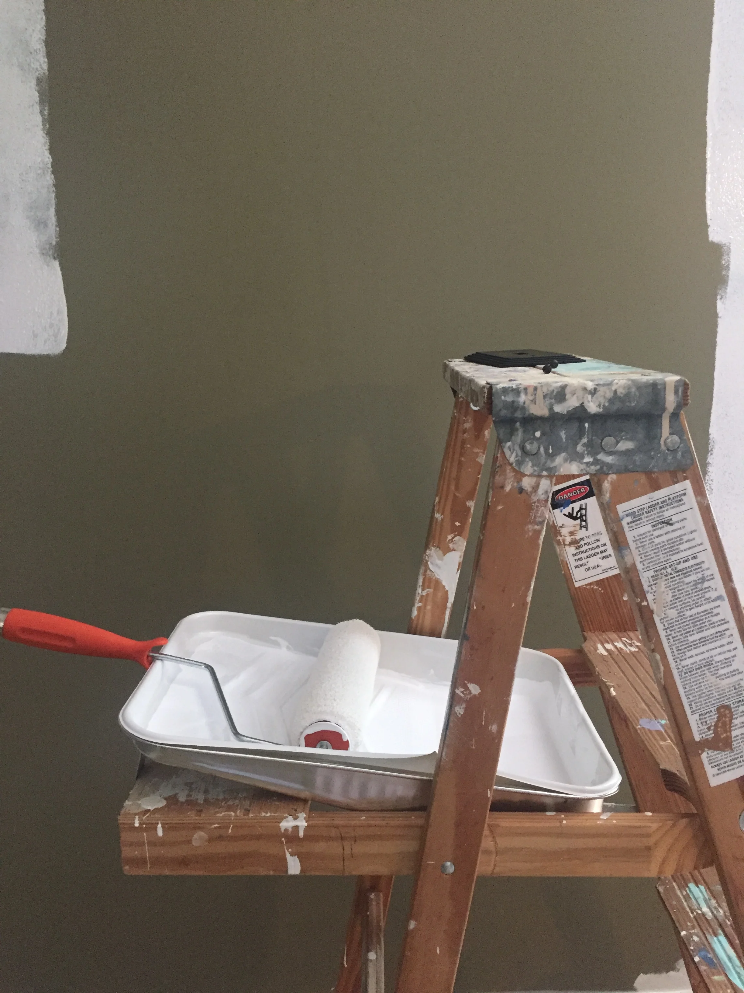
Here are some of the in progress pictures
Like I said.. very dark walls, The white was SO much prettier, and I love it so much. I will say though, if you're wanting to go with such a drastic darkness/lightness change, be prepared to use A LOT of paint. I used two gallons.
I didn't want to use a full in-your-face white, so I chose one from with some blue undertones(Little Bleu Studio must, y'all) and went with BEHR Bakery Box White
And this is the end result!! I loooooooove it! It feels so bright and open and clean. And see what I mean about adding the mirror on the right side to balance everything on that wall? I'm so much happier with it. Especially with the four curtain panels, that wall just feels so much more like the focal point of the room and it doesn't feel really heavy on the left anymore. And the window lets in a lot of light, and the mirror bounces a lot of light back into the room.
Also these two end tables are my favorites. I was looking for something mid-century modern and leggy, and I was over the moon to see these at Home Goods! And the drawers are super deep and will be great for storage, although I'm not sure what to store in end tables of guest rooms - any thoughts??
So thats it for now, once I get the book shelves - that are on the wall across from the bed) styled (and possibly painted) - I will share those too! And I can't wait to show you guys the gallery wall that is also in this space, but I still need to make/find a couple little smaller canvases to fill some gaps.


